The Eurozone's Long Depression
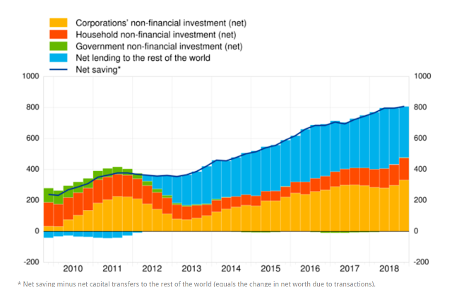
Sectoral balances can tell us so much about what is going on in an economy. Especially when they are expressed as a time series, as in this remarkable chart from the ECB : Although it is a time series, this is not a rate-of-change chart. The y axis is in billions of Euros, not in percentage growth rates. But the chart nevertheless shows that Eurozone net saving has risen steadily since the financial crisis, except during the Eurozone crisis of 2011-12 when it dipped slightly. What do we mean by "net saving"? The legend appears to conflate saving with investment, and the brief explanation at the bottom of the chart doesn't really help. So here's some simple algebra to sort it out. In national accounting, "saving" is the excess of income over desired consumption. For the private sector, it looks like this: S p = Y - T - C where Y is the net income of the private sector from all sources, T is tax payments, and C is all other consumption. Thus, ...